Coin Op Tap Room
Where high scores meet happy hours — a bold mashup of beer, buttons, and clever design that keeps customers coming back for another round.
Coin-Op Tap Room
Reviving Nostalgia with a Bold, Playful Brand Experience
The Brief
Coin-Op Tap Room wasn’t just opening another bar — it was building a retro-fueled destination. Equal parts arcade and craft beer haven, the brand needed to feel fun, electric, and familiar, while carving out a strong identity in a sea of taprooms and entertainment venues.
The Strategy
We leaned into the nostalgia of 80s–90s arcade culture while keeping the design system modern and punchy. Our goal: capture the kinetic energy of pixelated screens and joystick battles — without losing clarity or cohesion across brand touchpoints.
Brand Identity
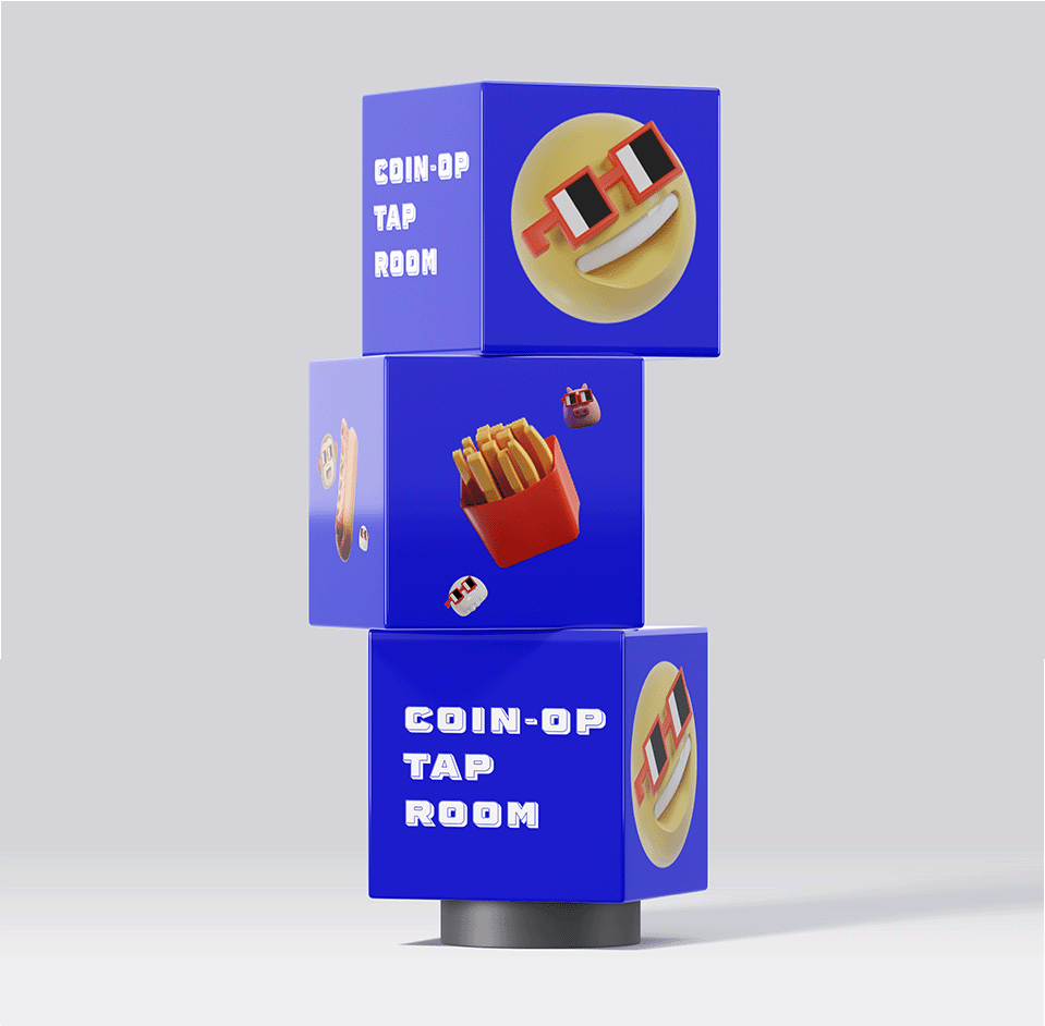
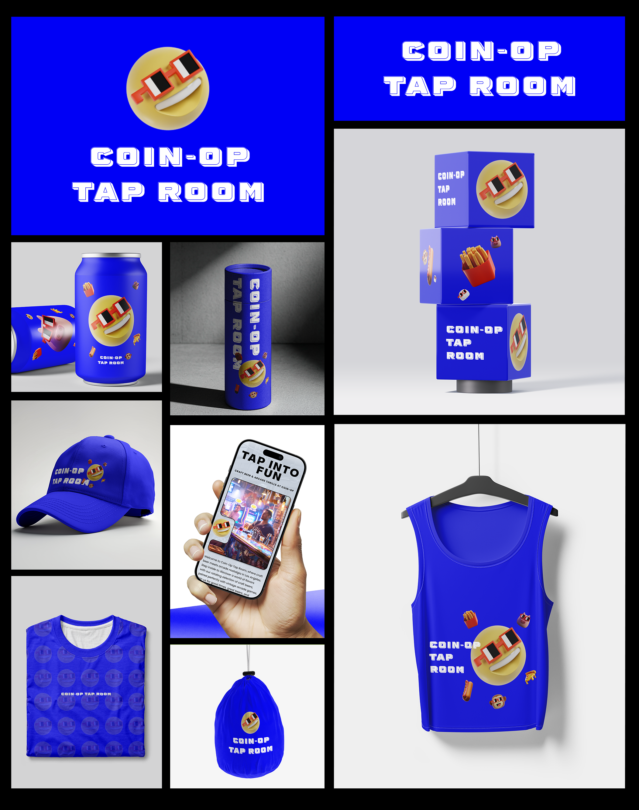
From the jump, we dialed in a visual style that fuses vintage vibes with bold, contemporary swagger. Pixel fonts, vibrant neons, and quirky iconography set the tone. The logo system was designed to work dynamically across screens, signs, cans, and swag — always playful, never overdone.
Environmental & Print Design
We extended the visual language into every corner of the experience — from menu boards to token bags, wall graphics to drink coasters. Each piece reinforced the brand’s blend of beer, buttons, and badassery.
The Result
Coin-Op Tap Room now hits like a high score. It’s a brand that pulls people in with fun and leaves a lasting impression through tight, purposeful design. Whether you’re here for the IPAs or the pinball, you’re stepping into something memorable.
Not new to this. Just better at it.